10 Things to Know When Designing a Dropshipping Website
Design a dropshipping website that converts. Learn mobile design, product photos, checkout flow, and trust signals that drive sales.


Building a dropshipping website means you need to pay attention to more than just picking products. Your website design can make or break sales. Most stores lose customers because they ignore basic design choices that build trust and make buying easier. If you're launching a new store or fixing an existing one, these 10 things that you should know will help you get more orders and fewer abandoned carts.
1. Mobile-First Design: Learn from Brands Like Nike
Over 80% of online shoppers now browse and buy on their phones. If your site doesn't work well on mobile, you're already behind. Mobile-first design means you plan for phone screens first, then expand to bigger screens. This isn't optional anymore.
Nike figured this out years ago when they saw their retail sales dropping. In 2016, they started building mobile apps like SNKRS and Nike Training Club as core parts of their business, not afterthoughts. By 2020, their mobile-first approach drove 82% more online orders and 19% revenue growth from digital channels alone. They turned phones into shopping tools by adding features like AR sneaker drops, personalized workout plans, and one-tap checkout.
What Good Mobile-First Design Looks Like
You need single-column layouts that don't require side scrolling. Buttons should be large enough for thumbs—at least 44x44 pixels. Text needs to be readable without zooming, usually 16px minimum for body copy. Navigation should collapse into hamburger menus to save space. Images must load fast and display correctly on smaller screens.
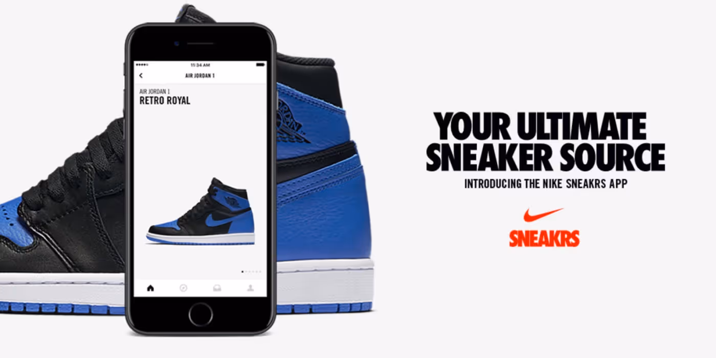
Nike's SNKRS app shows these elements working together. Their product images fill the screen, buy buttons are thumb-sized and bright, and checkout takes three taps. They use location tracking and AR features that only make sense on mobile, not desktop knockoffs. When a limited shoe drops, fans can buy it in seconds without fumbling through menus.
Test your site on actual phones, not just browser simulators. Ask friends to try buying something on their devices. Watch where they struggle. If they pinch to zoom or miss buttons, your mobile design needs work.
2. High-Quality Product Images: Your Silent Sales Team
Photos sell products when customers can't touch them. Generic supplier images that show up on 50 other stores won't build trust. You need photos that look professional and show your products clearly from multiple angles.

Each product needs 6-8 images minimum. Start with one clean hero shot on a white background showing the full product. Add 3-4 detail shots from different angles—top, bottom, sides, close-ups of textures or features. Include at least 2 lifestyle images showing someone using the product in real situations. If you sell clothing, show it on real people in different body types, not just thin mannequins.
Image quality matters more than you think. Shoot for at least 1200x1200 pixels. Use JPEG format for photos with lots of colors since it balances quality and file size. If you need transparent backgrounds, use PNG format. WebP format gives better compression if your platform supports it—files load faster without losing quality.
Using AI Tools to Fix Supplier Photos
Most dropshippers get stuck with mediocre supplier photos. AI image editors can fix this without Photoshop skills. Tools like Claid.ai and Flair.ai let you remove backgrounds, adjust lighting, upscale resolution, and add custom backgrounds at scale.
Claid.ai automatically detects products and removes messy backgrounds. You can batch-edit thousands of photos in minutes, not hours. It adjusts lighting to make products look consistent across your whole catalog. You can even add AI-generated lifestyle backgrounds that match your brand.
If supplier photos are low-resolution or poorly lit, run them through an AI enhancer first. These tools can upscale images, sharpen details, reduce noise, and fix colors automatically. The result looks professional without hiring a photographer. Just remember to review edited photos before uploading—AI sometimes creates weird artifacts if the original image is too damaged.
3. Write Clear Product Descriptions
Customers need to know exactly what they're buying before they click purchase. Vague descriptions kill sales. You want descriptions that highlight benefits, not just list features.
Bad Product Description Example
Here's what NOT to do:
"Premium quality watch. Made from durable materials. Multiple color options available. Fast shipping."
This tells customers nothing useful. What makes it premium? Which materials? How fast is shipping? Why should anyone care?
Good Product Description Example
Here's better:
"This minimalist leather watch brings classic style to your everyday look. The genuine Italian leather strap ages beautifully and feels soft against your skin, even after 12-hour workdays. The 40mm stainless steel case resists scratches and water splashes (50m rating). You can wear it to the office, gym, or date night without changing accessories. Available in black, brown, and navy to match your wardrobe. Ships to your door in 3-5 business days."
Notice the difference? The second description paints a picture. It explains how the watch fits into someone's life. It answers questions before customers ask them.
Using Smartli to Speed Up Writing
Writing 100+ product descriptions from scratch gets exhausting. AI tools like Smartli can generate first drafts in seconds. Smartli's Product Description Generator takes your product specs and creates SEO-friendly copy that highlights benefits. It also learns your brand voice if you feed it examples of your best descriptions.
But here's the catch—you can't just copy-paste AI output. You need to refine your drafts a bit and Smartli can help you do that. Add in your personality. Throw in details that matter to your specific customers. If you sell to busy parents, mention how a product saves time. If you sell to fitness fans, talk about performance. The human touch makes AI-generated descriptions actually sell.
4. Build Trust Through Reviews and Good Site Security

New visitors don't know if your store is real or a scam. You need visible trust signals on every page.
Display customer reviews and ratings on product pages. If you're just starting and don't have reviews yet, offer early customers a small discount in exchange for honest feedback after delivery. Real reviews with photos from customers build more trust than any marketing copy you write.
TrustPilot is one option for collecting and displaying reviews. It shows independent customer feedback that shoppers trust more than reviews on your own site. ScamAdvisor is another platform where customers check if stores are legitimate. Getting your site listed with a good rating helps skeptical shoppers feel safer.
Here's the reality though—ScamAdvisor has mixed reviews itself. Their algorithm sometimes flags new sites as risky just because they're new, which can hurt small stores unfairly. If you get listed, you may need to reach out to them to verify your business details. TrustPilot works better for most dropshipping stores since it focuses on actual customer feedback, not just website age.
Payment Security Matters
Customers need to know their payment data is safe. Use secure payment gateways like Shopify Payments, PayPal, Stripe, or Square that handle encryption for you. Display security badges from these payment processors in your footer and checkout pages.
Make sure all payment pages use HTTPS encryption—browsers show a padlock icon in the address bar. If customers don't see that lock, many will leave without buying. Offer multiple payment options: credit cards, digital wallets like Apple Pay and Google Pay, and buy-now-pay-later services like Afterpay or Klarna. More payment choices mean fewer excuses not to buy.
5. Keep Your Brand Identity Consistent

Your brand identity is more than a logo. It's the colors, fonts, images, and overall vibe that customers recognize.
Your logo needs to be simple, readable at any size, and memorable. It should work in color and black-and-white versions. Place it in your header so it's always visible. Typography matters too—pick one font for headings and one for body text. Don't mix five different fonts or your site looks messy.
Core Brand Elements to Nail Down
Pick a color palette and stick to it everywhere. Colors trigger emotions—blue feels trustworthy, green feels fresh and healthy, red feels exciting. Choose 2-3 main colors plus 1-2 accent colors. Use these exact colors in your logo, website buttons, product photos, and social media posts.
Photography style creates a mood. If your brand is fun and playful, use bright backgrounds and models smiling. If your brand is premium and minimal, use neutral backgrounds and clean composition. Whatever style you choose, use it for all your product photos so your store feels cohesive.
Inconsistent branding makes your store look thrown together. If your homepage is bright and colorful but your product pages are dark and serious, customers get confused about who you are. Pick a direction and commit to it.
6. Simplify Your Navigation So People Can Find Stuff
Your navigation menu should be so obvious that a distracted shopper can find products without thinking.
Keep Menu Labels Clear and Short

Use simple category names that match how customers think, not industry jargon. Instead of "Athleisure Collections," say "Women's Activewear" or "Men's Gym Clothes". Customers shouldn't have to guess what's behind each menu item.
Limit your main navigation to 5-7 categories maximum. More than that overwhelms people. If you sell lots of product types, group them into broader categories. For example, instead of listing "Yoga Pants," "Sports Bras," "Running Shorts," and "Tank Tops" separately, put them all under "Women's Activewear" with a dropdown menu.
Add a search bar in your header that's easy to spot. About 30% of visitors use search instead of browsing menus. Make the search icon large enough to tap on mobile. Consider using a sticky header that stays visible when visitors scroll down so they can always access the menu or cart.
Dropdown Menus Done Right
If you use dropdown menus, keep them short—10 items or fewer. Longer lists make people's eyes glaze over. Add a small delay before dropdowns appear on hover so people don't trigger them by accident. On mobile, make sure dropdown items are large enough to tap easily.
7. Fast Loading Speed Keeps People from Leaving
A slow site destroys sales. If pages take more than 3-4 seconds to load, you lose about 40% of visitors. They won't wait around, especially on mobile.
Speed Up Your Site
Compress images without losing quality. Tools like TinyPNG or built-in compression in Shopify and WooCommerce can shrink file sizes by 70% or more. Use a Content Delivery Network (CDN) to serve images faster to customers worldwide. Enable browser caching so returning visitors load pages instantly.
Remove unnecessary plugins and scripts that slow things down. Every extra plugin adds code that needs to load. If you're not using it, delete it. Lazy loading helps too—images below the fold only load when visitors scroll down to them.
Test your speed using Google PageSpeed Insights. It shows exactly what's slowing your site and suggests fixes. Aim for loading times under 3 seconds on mobile and desktop. Every second you cut can boost your conversion rate by 5-10%.
8. Simplify Checkout to Stop Cart Abandonment
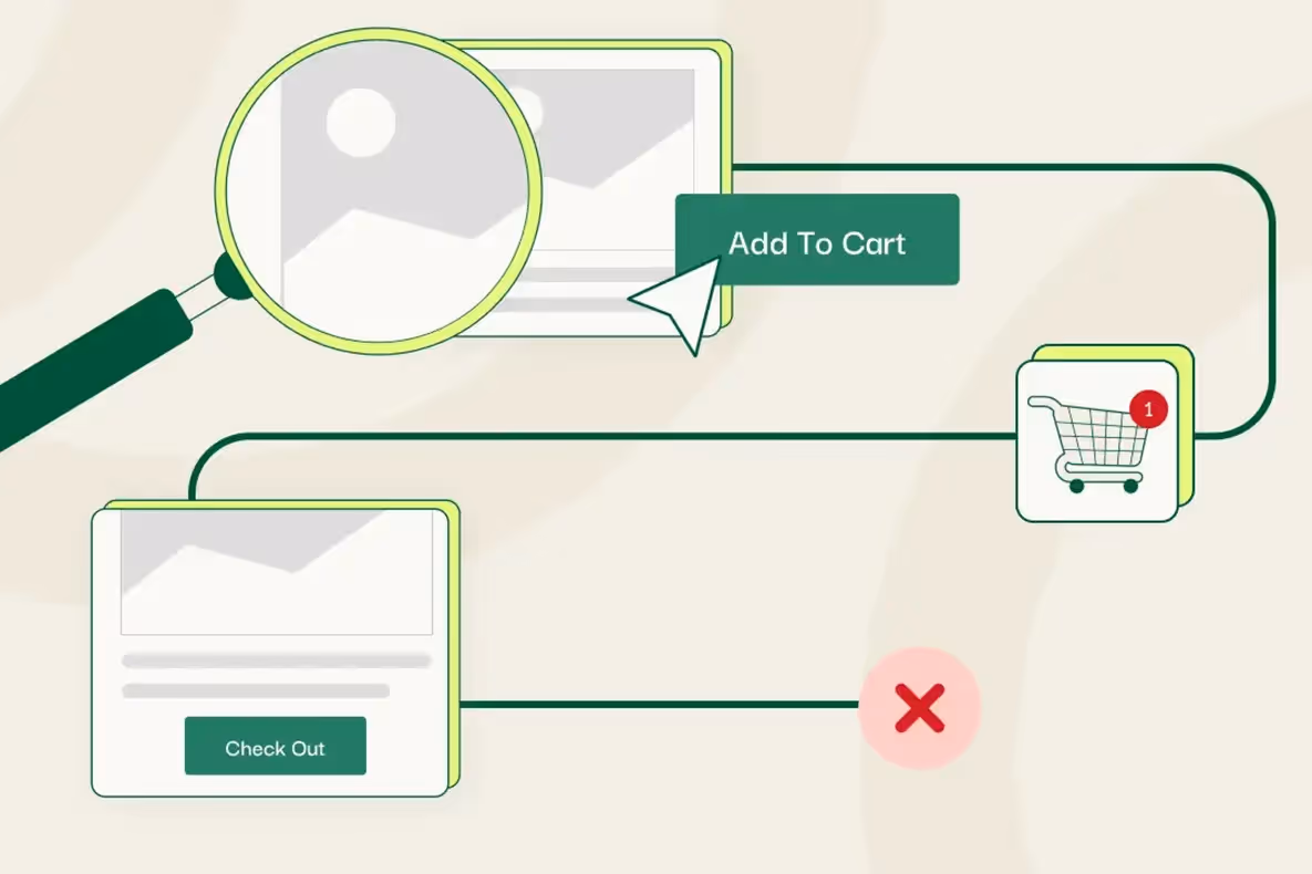
About 1 in 5 shoppers abandon carts before buying. A complicated checkout is the main reason. Make buying as easy as possible.
Reduce Checkout Friction
Keep checkout to 2-3 pages maximum, ideally one page if you can. Show a progress indicator so customers know how many steps remain. Only ask for information you actually need—name, email, shipping address, payment info. Don't make people create accounts before buying. Offer guest checkout and let them create accounts after purchase for next time.
Display the total price early, including shipping and taxes. Hidden fees at the end are the number one reason people abandon carts. If shipping costs surprise them on the final page, they leave. Be upfront about all costs.
Auto-fill fields where possible. Let browsers remember addresses and payment info. Offer one-click checkout options like Shop Pay or PayPal Express for returning customers. The faster people can finish buying, the more sales you get.
9. Use Strategic Calls-to-Action That Stand Out
Your "Add to Cart" and "Buy Now" buttons need to grab attention. Use colors that contrast with your background. If your site is mostly white and gray, make buttons bright blue or green. Button text should be action-oriented: "Add to Cart," "Buy Now," or "Get Yours Today"—not vague language like "Learn More" or "Continue".
How to Do This
Make buttons large enough to tap easily on mobile. Small buttons frustrate people and reduce clicks. Place primary CTAs above the fold so visitors see them without scrolling. Use visual hierarchy to guide eyes where you want them to go. Important information should be larger, bolder, or positioned higher on the page.
Reduce the number of font sizes and colors you use so the design feels organized. If everything is loud and bright, nothing stands out. Let your product images and buy buttons dominate.
10. Source Quality Products and Manage Inventory Smartly
Finding reliable suppliers with good product quality separates successful stores from failed ones. You need suppliers who ship fast, provide accurate product data, and don't run out of stock constantly. Spocket makes this easier by connecting you to over 100 million+ verified products from US and EU suppliers. Fast local shipping builds trust with customers who are tired of waiting weeks for packages from overseas.
Why Use Spocket with Your Store?
Spocket integrates directly with WooCommerce, Wix, and other major platforms. You can import products with one click, and inventory updates happen automatically so you never oversell. Branded invoicing lets you add your logo and branding to packing slips, making orders feel more professional. If you want to stand out, their print-on-demand and white label options let you customize products or sell under your own brand.
When you hit problems—and every store does—Spocket's 24/7 VIP customer support answers questions fast. You can order product samples to check quality before listing items in your store, with no minimum order quantities required. Their 7-day free trial lets you test everything before committing. If you're serious about building a real business, reliable suppliers and smooth inventory management aren't optional.
Conclusion
Designing a dropshipping website that actually sells requires balancing looks with function. Focus on mobile design, fast speeds, and clear navigation first. Use high-quality photos and honest product descriptions to build trust. Simplify checkout and show security badges to reduce hesitation. Your site is often the only impression customers get before deciding to buy or leave. Invest time in getting these design elements right, and your conversion rates will show it.
Start your dropshipping business today
Dropshipping Website FAQs
What's the biggest mistake new dropshipping stores make with design?
Most new stores copy templates without customizing them, so every page looks generic. Customers can tell when a site is rushed. Poor mobile design is another huge mistake—if buttons don't work or text is too small on phones, you lose half your traffic immediately. Take time to test your site thoroughly on real devices before launching to spot problems.
How can I improve my site's design if I'm not a designer?
Start with a clean, simple template from Shopify or WooCommerce that's built for conversions. Focus on one thing at a time—better photos this week, faster loading next week. Watch how visitors use your site with tools like Hotjar to see where they get confused. Small changes add up fast when you fix the most obvious problems first.
Should I hide prices until checkout to reduce sticker shock?
No. Hidden prices create distrust and drive people away. Shoppers want to know costs upfront, including shipping and taxes. If your prices are higher than competitors, focus on showing better value—faster shipping, superior quality, or better customer service. Transparency always wins over hiding information, even when prices aren't the lowest.
What design elements help reduce cart abandonment the most?
Display total costs early, before checkout. Show security badges near payment fields. Offer guest checkout without forcing account creation. Add trust signals like return policies and customer reviews near the cart. Include a progress bar during checkout so people know how many steps remain. Each small improvement removes friction that makes people abandon carts.
How often should I update my website design?
Don't redesign constantly—it confuses returning customers. Instead, make small tweaks every few months based on data. If a page has high bounce rates, test different layouts or copy. Update seasonal banners and featured products regularly to keep the site feeling fresh. A full redesign only makes sense every 2-3 years or when your brand direction changes significantly.
Can I use competitor product photos if we sell the same items?
No, that's copyright theft even if you're both dropshipping from the same supplier. Take your own photos or hire someone to shoot products. Use AI editing tools to enhance supplier photos and make them unique. Stolen images can get your store shut down by platforms like Shopify or result in legal issues. Always use photos you have rights to.


Launch your dropshipping business now!
Start free trial


Related blogs
Top WordPress eCommerce Themes for 2026
Explore the best WordPress eCommerce themes for 2026. Compare WooCommerce themes by speed, design, features, and dropshipping potential.


Saba Mohebpour Didn't Stop at Spocket: His New $50M Fund, ILA Capital, Is Buying Up Shopify and Amazon Apps
After building Spocket into a major ecommerce platform, Saba Mohebpour is launching ILA Capital with a $50M strategy to acquire Shopify and Amazon apps powering modern ecommerce.

Top Trendsi Alternatives for Fashion Dropshipping
Explore the best Trendsi alternatives for fashion dropshipping, fast shipping, branding, Shopify integration, and reliable suppliers.