Best YouTube Thumbnail Size and How to Design Clickable Thumbnails
Learn the exact YouTube thumbnail size in pixels and how to create thumbnails that drive clicks. Full guide with ratios and design methods.

YouTube thumbnails are your first impression. They sit next to video titles and are often the only visual a potential viewer sees before deciding whether to click. If you're uploading videos without understanding YouTube thumbnail size in pixels, you're leaving clicks on the table. The right dimensions matter just as much as your design choices.
When thumbnails are sized incorrectly, they look blurry, cut off, or amateurish on mobile devices—which is where most viewers watch. This guide covers everything from YouTube thumbnail size and resolution to the best practices for making thumbnails that people actually want to click.
What Is the Best YouTube Thumbnail Size?

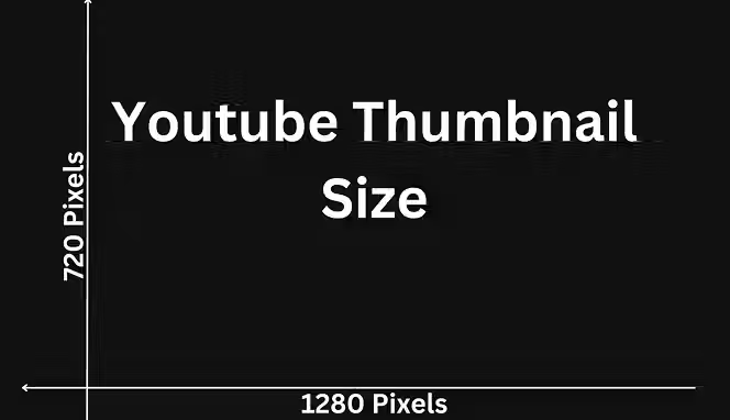
The best YouTube thumbnail size is 1280 x 720 pixels. This is the recommended dimension for maximum clarity and quality across all viewing platforms. YouTube thumbnail size in pixels matters because uploading at this resolution ensures your thumbnail stays sharp whether it's displayed on a desktop, mobile phone, or TV screen.
If you're wondering about YouTube thumbnail size in inches, that translates to roughly 17.78 x 10 inches at 72 DPI (dots per inch). Most creators don't think in inches though—YouTube thumbnail size ratio is what actually matters for your workflow.
The standard YouTube thumbnail size ratio is 16:9. This aspect ratio matches the video player itself, creating a consistent look across the platform. When you keep to this ratio, your thumbnail fits perfectly without distortion or awkward cropping.
Why YouTube Thumbnail Size and Resolution Matter?
Using the correct YouTube thumbnail size in pixels prevents quality loss. If you upload something smaller—say 640 x 360 pixels—YouTube will stretch it to fit the standard player size, and it'll look pixelated. On the flip side, uploading at 2560 x 1440 pixels won't make it sharper; YouTube will just compress it down.
The YouTube thumbnail size converter isn't something you need to use if you get the base dimensions right from the start. Just open your design tool and set your canvas to 1280 x 720 pixels. That's it.
Thumbnail file size also matters. YouTube thumbnail size reducer tools exist because your image file shouldn't exceed 2 MB. If it does, YouTube will compress it further, which degrades quality. Keep your file under 2 MB by exporting at 80% quality in most design programs.
YouTube Thumbnail Dimensions Across Different Platforms
Website image size guidelines are different from YouTube ones. Here’s what you need to know about YouTube thumbnail dimensions for different platforms:
Mobile vs. Desktop Display Sizes
On mobile, your YouTube thumbnail size and resolution gets displayed at roughly 280 x 157 pixels on the screen—much smaller than the source file. Text needs to be bold and large. Icons need to be simple. Small details will disappear.
Desktop viewers see more space, but they're often scanning quickly through recommended videos. Your YouTube thumbnail size height and width still needs to command attention instantly.
How to Size YouTube Thumbnails in Photoshop

Here’s how you can start sizing your YouTube thumbnails in Photoshop correctly:
Set Up Your Document
Open Photoshop and start a new document. Go to File > New. Set your width to 1280 pixels and height to 720 pixels. Choose RGB color mode at 8-bit. Make sure the resolution is 72 DPI.
If you're working with YouTube thumbnail size in Photoshop regularly, save this as a template. Go to File > Save as Template after setting it up once. Then every new project is ready to go with the correct YouTube thumbnail size height and width already set.
Resize Existing Images
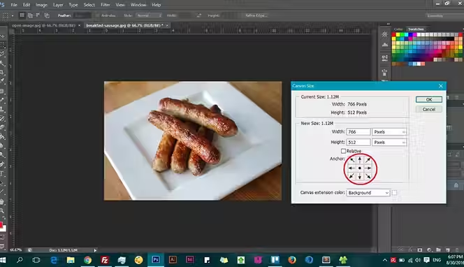
If you already have an image that doesn't match the YouTube thumbnail size ratio, don't just stretch it. Open the image, go to Image > Canvas Size, and enter 1280 x 720. Then position your image so nothing important gets cut off. This keeps the 16:9 YouTube thumbnail size ratio intact without distortion.
To use a YouTube thumbnail size reducer in Photoshop, go to Image > Scale Image and set the width to 1280. The height will auto-adjust if you have the chain link locked. This maintains your YouTube thumbnail size ratio automatically.
How to Create Thumbnails That Get Clicks

Focus on these elements and basics when it comes to making YouTube thumbnails:
Color and Contrast
Choose colors that stand out against YouTube's dark gray background. Bright colors—neon green, electric blue, hot pink—perform better than muted tones. Use high contrast between your text and background so it's readable even at small YouTube thumbnail size dimensions.
Avoid colors that blend together. Red and orange sit too close on the spectrum. Black text on dark gray vanishes. Test your design by shrinking it to mobile size (280 x 157 pixels) on your screen and seeing if it still pops.
Text and Typography
Keep text minimal. Two to three words maximum. Use bold, sans-serif fonts. Thin fonts disappear when your thumbnail appears at a smaller YouTube thumbnail size in pixels on mobile screens.
Make your main text cover about 20% of the thumbnail. It needs to be large enough to read at a glance when someone is scrolling through dozens of video options.
Facial Expressions and People
If you include faces, use clear expressions. Shock, joy, confusion—pick one strong emotion. A blurry face or neutral expression doesn't stop scrolling.
Position faces strategically. Avoid putting them right in the center where the YouTube player controls will cover them when the video plays.
Common YouTube Thumbnail Size Mistakes
Here are common YouTube thumbnail sizing mistakes you want to avoid:
Uploading at Wrong Dimensions
Uploading at 640 x 480 pixels or other non-standard YouTube thumbnail size ratios causes distortion. Always stick to 1280 x 720.
File Size Issues
A 5 MB YouTube thumbnail size reducer is necessary when your file is bloated. Use compression tools or export settings at lower quality percentages until you hit under 2 MB.
Too Much Detail
Tiny logos, small text, and intricate backgrounds fail at small YouTube thumbnail size height and width displays. Mobile viewers won't see it. Simplify.
Ignoring the Actual Video Content
Your thumbnail should connect to what's in the video. Misleading thumbnails get clicks but hurt watch time and engagement metrics. YouTube's algorithm notices.
Tools for Creating and Optimizing YouTube Thumbnails
Here are some tools you want to keep an eye on:
YouTube Thumbnail Design Software
Photoshop is professional-grade but costs money. Canva offers free templates with the YouTube thumbnail size already built in. Adobe Express is free and has built-in YouTube thumbnail size templates too.
Figma works for collaborative design. All these tools let you input custom YouTube thumbnail size in pixels—just enter 1280 x 720 and you're set. You can also use Logome to make logos for YouTube thumbnails at the right size. Smartli’s background remover and AI photo enhancer are other tools that can help.
Batch Processing Tools
If you're uploading multiple videos, batch processing saves time. Adobe Bridge or even free batch resize tools let you resize a folder of images to the standard YouTube thumbnail size ratio at once.
How to Improve Your Visibility and Get More Views with Custom YouTube Thumbnails?
Your thumbnail is doing one job: stopping the scroll. When someone is scanning through their feed or search results, your thumbnail has roughly one second to catch their eye. That's where visibility comes in. A weak thumbnail blends into the background noise. A strong one stops people mid-scroll.
YouTube's algorithm cares about click-through rate (CTR). If your thumbnail gets clicks, the algorithm assumes your video is relevant and pushes it higher in recommendations. If it doesn't, the video stays buried. Custom thumbnails beat YouTube's auto-generated ones because you control every element—color, text, composition, emotion. You're not leaving visibility to chance.
Here's what happens when you invest in your thumbnails. First, your CTR goes up. Studies show well-designed thumbnails can increase CTR by 5-30%. Second, YouTube notices the higher engagement and recommends your videos more often. Third, more views come in, which feeds the algorithm loop again.
Color and Contrast Build Recognition
The visibility benefit extends beyond YouTube's algorithm. When your thumbnail stands out, people are more likely to share your video on social media. A compelling thumbnail makes people want to show others. This brings organic traffic from outside YouTube, which the platform tracks and rewards.
Color psychology matters here. Bright, saturated colors grab attention faster than muted tones. Red, orange, and yellow perform well because they trigger quick decisions in the human brain. If you're using stock images or screenshots, the background often won't have enough contrast. Add colored bars, shapes, or text overlays to bump up visibility.
Mobile-First Design Matters
Font size directly impacts visibility too. If your main text is small, mobile viewers won't register it. About 70% of YouTube watches happen on mobile devices, where your thumbnail shrinks to 280 x 157 pixels. Text that's readable at full size might become illegible on a phone screen. Test your design at mobile size before uploading.
Consistency Trains Your Audience
Another visibility hack is consistency. If you have a series or channel style, use similar fonts, colors, or layouts. Viewers start recognizing your thumbnails faster, which means they click faster when they see your face or your signature colors appear in their feed. Consistency trains your audience to trust your content.
Facial Expressions and Simplicity Win
Facial expressions matter for visibility too. A confused face, a shocked expression, or genuine excitement travels further than a neutral expression. The human brain processes faces faster than other visual elements. When someone sees a strong emotion in your thumbnail, they pause, even if just for a moment. That pause is the window you need for a click.
Don't add too many elements to your thumbnail. More isn't more here. Simplicity wins. One or two focal points, bold text, and high contrast is all you need. Cluttered thumbnails confuse the eye and fail to grab attention. You want people to understand your thumbnail in under a second.
Test and Adapt Based on Data
Test different thumbnail styles for the same topic. Some audiences respond to minimalist designs; others prefer busy, layered ones. YouTube Creator Studio shows you CTR data for each upload, so you can see which style your audience responds to. Use that data to adjust future thumbnails.
Best Practices You Should Know for Making YouTube Thumbnails
Follow these best practices for making better YouTube thumbnails in the right sizes:
1. Get the Technical Requirements Right
Start with the right size. 1280 x 720 pixels at a 16:9 ratio. Every other dimension is a compromise. Save your file as JPG at 80% quality to keep it under 2 MB. These aren't suggestions—they're requirements for your thumbnail to display cleanly.
2. Contrast Is Non-Negotiable
Use contrasting colors. If your background is dark, use light text and bright accents. If your background is light, go dark. Avoid putting similar colors next to each other. Red and orange blur together. Light gray on white disappears. High contrast makes thumbnails readable at any size.
3. Keep Text Short and Punchy
Keep text short. Two to three words maximum. Long sentences get cut off or become unreadable. Use words that punch—numbers, action words, questions. "BIGGEST MISTAKE" performs better than "Common Errors That People Make." Shorter text also means you can use a larger font size, which improves readability on mobile.
Choose readable fonts. Sans-serif fonts like Arial, Helvetica, or Montserrat work better than serif fonts or script fonts. Thick, bold fonts are more legible than thin ones. If your font has thin strokes, they disappear when YouTube compresses the image or displays it at small sizes.
4. Position Elements Strategically
Position important elements off-center. Many YouTube players show overlays in the center—the pause button, progress bar, controls. If your main focus point is dead center, it gets hidden or obscured when someone hovers over the video. Move your focal point slightly up, down, left, or right.
Avoid text on text. If you layer text on top of a photo, it often becomes hard to read. Instead, add a solid bar behind your text—a colored rectangle or semi-transparent overlay. This keeps text readable no matter what's in the background.
5. Create a Clear Focal Point
Use one dominant focal point. Your eye should know where to look first. That's usually a face, a number, or a surprising object. Make that element large and put it in the strongest position. Secondary elements should be smaller and less distracting.
6. Test on Mobile First
Test on mobile. Open your thumbnail on a phone screen at actual size. Can you read the text? Does the color scheme still stand out? If not, adjust before uploading. What looks good on a desktop monitor often fails on a mobile screen.
7. Maintain Channel Consistency
Stay consistent with your channel style. Similar fonts, color palettes, or layout structures help people recognize your thumbnails. When your audience scrolls past, they'll spot your video faster because it matches your previous uploads.
8. Match Your Thumbnail to Your Content
Avoid false or misleading thumbnails. Thumbnails that don't match your video content hurt watch time and engagement metrics. YouTube's algorithm catches this and stops recommending your videos. The short-term click boost isn't worth the long-term damage.
9. Less Is More with Effects
Don't use too many effects or textures. Gradients, shadows, and overlays can look good, but they also add file size and can make text harder to read. Keep effects minimal. Solid colors and simple shapes work better than complex effects.
10. Use High-Quality Source Material
Use high-quality images. Blurry, pixelated, or low-res photos make your thumbnail look unprofessional. Stock photo sites have cheap or free options. Make sure whatever image you use is at least 1280 x 720 pixels to avoid upscaling, which creates blurriness.
Conclusion
Getting your YouTube thumbnail size right is very important because you don't want parts of your thumbnail to be cropped out or just appear unappealing. Your viewers will comment on your thumbnails and if it's a bad thumbnail or poorly sized one, then you're going to have a tough time getting those views in.
If you want more likes, comments and subscribes on your videos then you should focus on nailing the right sizes for your YouTube thumbnails. Hopefully our guide gave you some clarity on what that is. Apply our best YouTube thumbnail making practices and you should see your click-through rates climb soon.
YouTube Thumbnail Size FAQs
What is the exact YouTube thumbnail size in pixels for uploading?
YouTube's recommended YouTube thumbnail size in pixels is 1280 x 720. This is the highest quality and matches the 16:9 aspect ratio perfectly. Never upload smaller than this resolution for best clarity.
Can I use a different YouTube thumbnail size ratio than 16:9?
YouTube won't reject different ratios, but 16:9 is the standard YouTube thumbnail size ratio and displays best across devices. Using 1:1 or 4:3 ratios causes cropping or black bars, making your YouTube thumbnail size look wrong on the player.
How do I know what YouTube thumbnail size reducer I need?
Your file shouldn't exceed 2 MB. If it does, compress it by lowering the quality export settings from 100% to 80% in your design software. This brings down file size without visible quality loss at YouTube thumbnail size in pixels.
What's the minimum acceptable YouTube thumbnail size in pixels?
While you can upload smaller images, they won't look as sharp. 1280 x 720 is the minimum recommended YouTube thumbnail size in pixels. Going smaller means potential blurriness at larger display sizes.
How do I measure YouTube thumbnail size in inches for print?
At 72 DPI, 1280 x 720 pixels equals roughly 17.78 x 10 inches. This YouTube thumbnail size in inches conversion is rarely needed for online work, but it matters if you're creating materials for print or learning design fundamentals.
Does YouTube thumbnail size and resolution change for different video lengths?
No. Whether your video is 30 seconds or 30 minutes, use the same YouTube thumbnail size in pixels: 1280 x 720. The YouTube thumbnail size ratio stays 16:9 regardless of content type.
Launch your dropshipping business now!
Start free trialRelated blogs

Shipping in India: India Post, Delhivery and Courier Comparison for 2026
Compare India Post, Delhivery, Blue Dart and DTDC shipping rates, speed, and coverage. Find the best courier for your business in 2026.

Mobile-First Indexing Tips for Dropshipping Stores That Want to Rank and Convert
Learn practical mobile-first indexing tips for dropshipping stores to improve SEO, mobile usability, crawlability, and conversions without hurting store speed.

Is Roposo Clout Legit? Roposo Clout Review and Best Alternatives
Is Roposo Clout legit? Yes, it was, but it shut down in April 2026. Find out what happened. Compare the best Roposo Clout alternatives available for Indian dropshippers.


.avif)


