How Do You Create Product Pages That Compel Shoppers to Buy?
Steal a proven blueprint for high-converting product pages—hero, proof, risk reversal, mobile UX, schema, and tests to run first.
.avif)

Ever wondered why some online stores turn browsers into buyers while others struggle to get a single click on “Add to Cart”? The secret isn’t just in the product — it’s in the page. A well-crafted product page doesn’t just display an item; it tells a story, builds trust, and makes shoppers feel confident enough to buy.
In this guide, you’ll learn how to create product pages that convert — pages that grab attention, answer objections, and lead customers smoothly toward checkout. We’ll break down the proven design elements, psychology-driven copy techniques, and optimization tactics used by high-converting ecommerce brands.
Whether you’re launching your first online store or revamping your existing product pages, this article will give you a clear, actionable roadmap to turn casual visitors into loyal customers. Let’s build product pages that sell without shouting.
What Makes a High-Converting Product Page?
Let’s be honest — not every product page sells. Some pages make shoppers hit “Add to Cart” in seconds, while others make them bounce faster than you can say “free shipping.” So what separates a high-converting product page from the rest?
It’s all about how you guide your visitor’s emotions, attention, and confidence — from the moment they land on your page to the moment they buy.
Understanding What “Conversion” Really Means
A conversion happens when a visitor takes the action you want — most often, making a purchase. But that’s not the only metric that matters. On a product page, conversions can also mean:
- Adding a product to the cart
- Signing up for a restock notification
- Clicking “Buy Now”
- Starting checkout
- Subscribing for future updates
Each action shows intent. The higher your conversion rate, the more people you’re successfully persuading to take that next step.
When you track metrics like add-to-cart rate, purchase rate, and checkout completion, you start to see where customers drop off — and where your page needs work. That’s the foundation of ecommerce conversion optimization.
Key Elements of a High-Converting Product Page
Think of your product page as your online salesperson. Every section should remove doubt and build desire. Here’s what great pages have in common:
1. A Clear, Benefit-Driven Headline
Don’t just name the product — sell its value.
Example: Instead of “Organic Cotton T-Shirt,” say “Stay Cool All Day in Our 100% Organic Cotton Tee.”
That instantly connects features with benefits.
2. High-Quality, Contextual Images
Your visuals should make customers imagine owning the product. Use multiple angles, lifestyle shots, and short demo clips. Shoppers should feel like they can touch it through the screen.
3. Honest, Persuasive Copy
Skip the fluff. Focus on how your product solves problems or adds joy. Use short sentences and everyday language. Write as if you’re explaining it to a friend who’s about to hit “Buy.”
4. Trust Builders Everywhere
Add customer reviews, star ratings, and real photos. Highlight your guarantees, refund policies, or any safety certifications. Each element says, “You can trust us.”
5. A Strong, Noticeable Call-to-Action
Your “Add to Cart” or “Buy Now” button should stand out. Use contrasting colors and direct language like “Get Yours Now” or “Try It Today.”
6. Simple, Distraction-Free Layout
Keep your design clean. Too many pop-ups or long paragraphs make visitors lose focus. Guide their eyes toward what matters — the product and the purchase button.
Small Tweaks, Big Conversions
Here’s the good news: you don’t need a complete redesign to improve your conversion rate. Sometimes, small adjustments make a huge difference.
- Changing your CTA color can lift clicks by 10–20%.
- Adding delivery info above the fold can reduce cart abandonment.
- Displaying the number of reviews increases trust instantly.
- Rewriting product descriptions in a conversational tone can double engagement.
These tweaks turn passive browsers into active buyers — and that’s exactly what a high-converting product page does.
Step-by-Step Guide on How to Create Product Pages That Convert
Now that you know what makes a product page perform well, let’s get hands-on. This step-by-step guide will show you exactly how to create product pages that convert — with clarity, credibility, and customer-first design.
Each section you build should answer a shopper’s silent question: “Why should I trust this and buy now?”
Let’s break it down.
Step 1: Craft a Compelling Above-the-Fold Section
Your above-the-fold area is your first impression. It’s what shoppers see before scrolling. You have just a few seconds to grab attention — so make it count.
1. 1. Write a Benefit-Driven Headline
Think beyond features. Focus on what’s in it for your customer. Instead of “Wireless Headphones Model X,” say: “Experience Pure Sound Without the Wires.”
That instantly communicates value and emotion. Your headline should answer the “why” in one glance.
1. 2. Use High-Quality Product Images or a Short Demo Video
Shoppers buy with their eyes. Invest in crisp, clear photos that show your product from multiple angles. Add a lifestyle image that helps buyers imagine owning it.
Even better? A short 10–15 second video demo that shows how it works or feels. Videos boost engagement and build confidence faster than text ever could.
1. 3. Show Price, Return Policy, and Delivery Details Clearly
Don’t make customers hunt for crucial info. Place the price, shipping time, and return policy where they can see it instantly. Transparency reduces hesitation — and hesitation kills conversions.
A small line like “Free returns within 30 days” can do wonders.
1. 4. Add a Sticky “Add to Cart” Button for Mobile Users
Most online shoppers browse on their phones. That means your CTA should always stay visible. A sticky “Add to Cart” button keeps your offer front and center, even when users scroll down. It’s one of the easiest ecommerce UX improvements you can make.
Small changes like these in your product page layout can make your site feel smoother, faster, and more buyer-friendly — the perfect recipe for conversions.
Step 2. Build Trust With Social Proof
Here’s the truth — people buy when they see others buying. Trust isn’t something you can just tell your customers to have; you earn it through social proof.
2. 1. Showcase Real Reviews and Ratings
Don’t hide your reviews — highlight them. Include star ratings, verified buyer tags, and snippets from happy customers. People trust other people more than they trust marketing copy.
Pro Tip: A review section near the product price or CTA can lift your conversion rate trust signals instantly.
2. 2. Include User-Generated Photos or Influencer Content
Customers love seeing real-life product use. Feature photos shared by buyers or short clips from influencers who’ve used your product. It adds authenticity — and turns your customers into brand advocates.
2. 3. Add Credibility Badges and Media Mentions
Have you been featured in the press or won awards? Flaunt it. Add badges like “As Seen In Vogue” or “Trusted by 10,000+ Customers.” These quick visual cues assure visitors they’re shopping with a brand that’s proven and popular.
Trust is built in layers — each review, badge, and testimonial adds one more reason to click Buy Now.
Step 3. Make Decision-Making Easy
You’ve caught their attention and earned their trust — now remove every ounce of friction left. When people hesitate, they leave. Your job? Make saying “yes” effortless.
3. 1. Add Helpful Size Charts, Comparison Tables, and FAQs
Confusion is the enemy of conversion. If customers can’t find fit details or product specs, they’ll leave for someone who makes it clear.
Include size guides, comparison charts, and short FAQs that address common doubts like:
- “Will this fit me?”
- “Is it compatible with my device?”
- “How long does it last?”
These reduce pre-purchase anxiety and improve your product page optimization dramatically.
3. 2. Clearly Describe Materials, Usage, and Compatibility
Be honest and precise. Mention what your product is made of, how to use it, and what it works best with. Example: “Crafted from 100% recycled polyester. Works seamlessly with iPhone and Android devices.” Simple, clear, and credible.
3. 3. Use Bullet Points for Scannable Content
No one reads long blocks of text anymore. Break your information into bullet points and short paragraphs. This improves readability and keeps your ecommerce UX clean.
Example layout:
- 100% organic materials
- Machine washable
- Ships within 48 hours
- Free returns
Easy to skim, easy to trust, easy to buy.
Step 4. Reduce Risk and Show Transparency
Online shoppers are cautious — and that’s fair. They can’t touch or test your product, so they rely on trust. Your goal? Remove every ounce of doubt.
A high-converting product page doesn’t just show what to buy — it shows why it’s safe to buy. That’s where transparency becomes your strongest conversion trigger.
4. 1. Highlight Clear Return and Refund Policies
Your return policy is one of the most powerful trust builders on your site. Shoppers want to know: “What if I don’t like it?”
Be upfront. Don’t bury your return details in fine print. Display a short, friendly line near the “Add to Cart” button like:
“Free returns within 30 days — no questions asked.”
This simple statement reduces hesitation and boosts confidence. Great return policy optimization turns “maybe later” into “why not now?”
4. 2. Add Shipping Timelines and Warranty Info
Clarity creates confidence. Tell customers exactly when they’ll receive their order:
- Ships in 24 hours
- Delivered within 3–5 business days
- Express delivery available
Add warranty information, too. A one-year or lifetime guarantee shows that you stand behind your product. It’s one of the strongest ecommerce trust elements you can include.
When customers see clear delivery expectations and a warranty promise, they feel safe hitting “Buy.”
4. 3. Use Urgency and Reassurance Together
Urgency triggers action. Reassurance keeps it ethical.
You can say things like:
- “Only 3 left in stock!”
- “Order within 2 hours for same-day dispatch.”
- “Free returns. Fast delivery.”
These phrases add excitement while keeping the buyer at ease. It’s about balancing motivation and trust — the ultimate combo for conversions.
Transparency turns risk into reliability — and reliability turns visitors into buyers.
Step 5. Boost Average Order Value (AOV)
You’ve earned the click. Now, it’s time to gently encourage shoppers to spend a little more — without feeling pushy.
The trick? Use smart product page upsells and cross-selling to make every order feel like a better deal.
5. 1. Suggest Bundles and Complementary Items
If someone’s buying a camera, show them a lens bundle. If it’s a skincare serum, offer a “glow duo” with a moisturizer. Bundles make shoppers feel they’re getting more value for less effort.
Pro tip: Highlight the savings.
“Buy the bundle and save 15%.”
That single line can raise your ecommerce AOV immediately.
5. 2. Display “Frequently Bought Together” Products
Amazon does this brilliantly — and you can too. Show a “Frequently Bought Together” section right under your main product. Use visuals, small discounts, or one-click add-to-cart options.
When buyers see what others pair with their item, it feels like social proof and convenience rolled into one.
5. 3. Add Limited-Time Offers or Volume Discounts
Scarcity creates urgency. Add a timer, countdown, or “ends tonight” tag to boost conversions.
Examples:
- “Buy 2, get 1 free.”
- “10% off when you buy three or more.”
- “Offer ends in 3 hours.”
These conversion triggers encourage shoppers to make faster, bigger purchases — boosting both sales and satisfaction.
Step 6. Optimize for Speed and Mobile
Let’s face it — slow pages kill conversions. If your site takes more than two seconds to load, half your visitors are already gone.
That’s why website speed optimization and mobile product page design are non-negotiable for modern ecommerce success.
6. 1. Keep Load Times Under 2 Seconds
Use compressed images, modern file formats (like WebP), and lazy loading. Avoid heavy pop-ups and autoplay videos that slow down the page.
A fast site isn’t just good for users — it’s good for SEO. Google loves speed, and so do shoppers.
6. 2. Design for Mobile First
Most customers browse — and buy — on their phones. That means your mobile product page design should feel effortless.
Keep buttons large, fonts legible, and scrolling smooth. Make sure your “Add to Cart” button is always visible (a sticky CTA works wonders).
If shoppers have to zoom, pinch, or squint — they’ll leave.
6. 3. Test Thumb-Reach and Scrolling Behavior
Design with the thumb in mind. Place key CTAs and interactive elements within easy reach.
Run user tests or heatmaps to see where people tap most often. If users can scroll smoothly and interact easily, your ecommerce performance will skyrocket.
Product Page SEO Best Practices
Even the most beautiful product page won’t convert if nobody finds it. That’s where product page SEO comes in. It’s not just about keywords — it’s about visibility, clarity, and relevance. When your page is optimized for both search engines and shoppers, you attract more qualified traffic and increase conversions.
Let’s make your product pages Google-friendly — without sounding robotic.
On-Page Optimization
Think of on-page SEO as your page’s handshake with Google. It tells search engines what your product is about and why it deserves to rank. Here’s how to get it right.
1. Write Keyword-Rich Titles and Meta Descriptions
Your title tag is your first impression on search results. Keep it short, clear, and descriptive.
Instead of: “Women’s Sneakers | Brand Name”
Try: “Lightweight Women’s Sneakers for Everyday Comfort | Brand Name”
See the difference? It includes a natural keyword and focuses on benefit.
Now, craft a meta description that sells. Use an active tone, mention unique features, and include a soft call-to-action.
Example: “Discover lightweight women’s sneakers designed for comfort and style. Shop now for free delivery and hassle-free returns.”
That’s SEO with personality — clear, clickable, and value-packed.
2. Optimize Alt Text for Images
Search engines can’t see your images — they read them through alt text. Use short, descriptive phrases that explain what’s in the picture and include relevant keywords.
For example:
✅ “Black leather tote bag with gold chain strap”
❌ “IMG_1234”
This improves alt text optimization, accessibility, and image search visibility — all leading to better rankings.
3. Structure Content with H2s and H3s
Good structure helps both humans and search engines understand your content. Break your copy into sections using H2 and H3 tags that describe each topic clearly.
For instance:
- H2: Features That Make Our Sneakers Stand Out
- H3: Breathable Design for All-Day Comfort
This creates a logical flow, keeps readers engaged, and gives Google a clear map of your content.
4. Add Internal Links to Related Products or Categories
Internal links keep visitors exploring your store — and they signal relevance to search engines.
Link related products under a “You Might Also Like” section or mention other collections naturally in your description.
Example: “Pair these sneakers with our athleisure leggings for a complete look.”
This simple step increases time on site, reduces bounce rate, and strengthens your SEO footprint.
When you combine all these tactics, your product page SEO becomes both human-friendly and algorithm-approved.
Use Schema Markup for Better Visibility
Here’s the secret weapon most brands overlook — schema markup. It’s a special language that helps Google understand your product details and display them beautifully in search results.
Done right, it can earn you Google rich results — those eye-catching snippets with ratings, prices, and availability that boost clicks instantly.
1. Implement Product Schema
Product schema tells Google exactly what your product is — including its name, brand, price, and availability. When Google understands your page clearly, it can display:
- Ratings
- Prices
- Stock status
This makes your listing more appealing and trustworthy at a glance.
2. Add Review and Rating Schema
Customers love social proof, and so does Google. By marking up customer reviews and average ratings, your product can show golden stars right under its search listing.
That visual cue alone can increase your click-through rate (CTR) by up to 30%.
3. Include FAQ Schema for Extra Space in SERPs
Add an FAQ section that answers common customer questions (like shipping time, warranty, or return policy). Then apply the FAQ schema so those answers appear directly under your search result.
This not only improves product page structured data but also boosts your credibility — you’re helping before the click even happens.
4. Combine Schema Types for Maximum Impact
The best product pages layer multiple schema types together — Product, Review, FAQ, and Breadcrumb. This helps Google create a complete picture of your page, improving discoverability and trust signals.
In short, schema markup = better context for search engines + better confidence for shoppers.
A/B Test and Improve Your Product Pages
Here’s the truth — no matter how good your product page looks today, there’s always room to make it better. The smartest brands don’t guess what works — they test it. That’s where A/B testing product pages comes in.
It’s simple. You create two versions of a page (A and B), change one element, and see which one performs better. Over time, these small tweaks can lead to massive gains in conversions.
1. Test the Elements That Matter Most
Start with the parts that influence first impressions and buying decisions.
Headlines: Try benefit-driven headlines versus emotional ones. Example:
- “Softest T-Shirt You’ll Ever Own”
vs. - “Stay Cool and Confident All Day.”
Images and Videos: Compare lifestyle shots versus close-ups. Test adding short demo videos — they often increase engagement.
CTA Colors and Copy: Don’t underestimate your “Add to Cart” button. Test colors (orange, green, or red) and text (“Buy Now” vs. “Get Yours”).
Layouts: Move your trust badges or reviews higher on the page. Sometimes, a simple layout change can double your conversion rate optimization (CRO) results.
2. Track Key Metrics That Reflect Real Behavior
Testing without tracking is just guessing. Keep an eye on:
- Conversion rate: How many visitors make a purchase.
- Add-to-cart rate: How many add items but don’t finish checkout.
- Bounce rate: How many leave after a few seconds.
- Scroll depth: How far shoppers go down your page.
These numbers tell you exactly where your product page is losing interest — and where to fix it.
Pro tip: Tools like Google Optimize, Hotjar, or Shopify’s built-in analytics make it easy to run tests and track data.
3. Use Data to Drive Better Decisions
Let data be your guide, not your gut. If one headline increases conversions by 15%, make it your new default. If a video boosts engagement but slows load speed, compress it — don’t remove it.
Test. Measure. Learn. Repeat. That’s the formula behind every high-converting ecommerce brand.
4. Keep Testing — Always
Consumer behavior changes, trends evolve, and design expectations shift. Regular A/B testing helps your store stay ahead of those changes. Think of it as tuning a performance car — you don’t stop at one adjustment.
Continuous testing equals continuous growth.
Checklist for a High-Converting Product Page
Before you hit publish, run your product page through this quick ecommerce optimization checklist. Each item here acts like a small gear — together, they keep your sales engine running smoothly.
1. Clear and Benefit-Focused Headline
Your headline should tell visitors why they should care — not just what you sell.
Example: “Hydrate Faster. Feel Better.”
A strong headline hooks attention instantly.
2. High-Quality Visuals and Videos
Show your product in action. Include multiple images, lifestyle shots, and short videos. If shoppers can see themselves using it, they’re halfway to buying it.
3. Visible Price, Returns, and Shipping Info
Keep these front and center. Transparency kills hesitation. Simple lines like “Ships in 24 hours” or “Free 30-day returns” build instant trust.
4. Reviews and Social Proof
Add real customer photos, testimonials, and star ratings. Nothing sells better than proof that others love what you’re selling.
5. Strong CTA Button
Your call-to-action should stand out visually. Use active words — “Get Yours Now” or “Shop the Look.” Make sure it’s always visible, especially on mobile.
6. Fast Load Speed
Speed is a silent conversion killer. Compress images, remove unnecessary scripts, and aim for a 2-second load time. Remember: a fast site means a happy shopper.
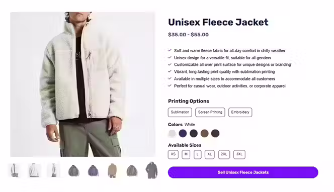
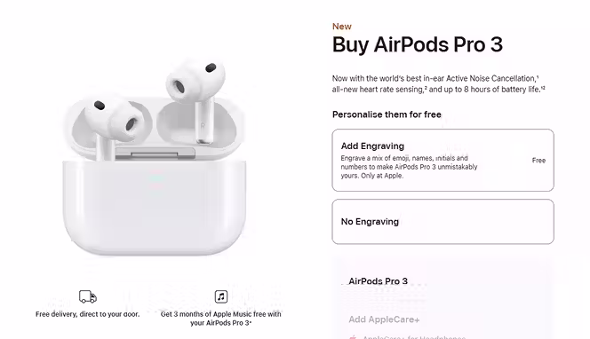
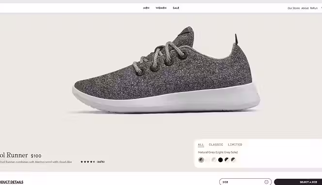
5 Best Product Page Examples (Quick Inspiration)
Here are 5 best product page examples for your inspiration
1. Apple AirPods Pro
Minimal layout, benefit-first copy, tight media block, and clear pricing/availability. A frequent pick in high-converting roundups for its focus and friction-free UX.
2. Allbirds Wool Runners
Crisp imagery, sustainability story, and prominent returns/shipping details right near the CTA. Commonly cited as a model for clean, confidence-building PDPs.
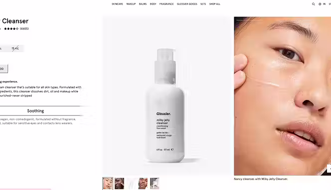
3. Glossier Milky Jelly Cleanser
Benefit-led headline, UGC/reviews, concise FAQs, and scannable bullets that answer objections fast. Featured in multiple “best product page” lists
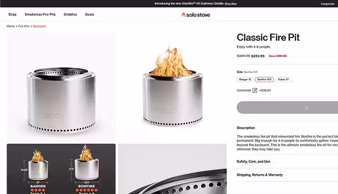
4. Solo Stove Bonfire
Strong hero media, comparison blocks, and bundles that lift AOV; frequently referenced for persuasive visuals and decision aids.
5. Warby Parker Eyeglasses
Clean spec details, try-at-home messaging, and trust signals near the CTA; a staple example in ecommerce inspiration guides.

Conclusion
Building product pages that truly convert isn’t about flashy design or tricksy copy. It’s about clarity, trust, and persuasion in just the right places. Use benefit-driven headlines, social proof, transparent policies, mobile-friendly layouts, and SEO best practices—and continuously test to refine.
When you apply these tactics—and keep your eye on performance—you’ll see real lifts. Ready to scale your dropshipping or wholesale business? Try Spocket to find top products, automate order fulfillment, and boost your margins. Start your free trial today and let your product pages do the heavy lifting.
Start your dropshipping business today
FAQs About Creating Product Pages That Convert
How to create a high-converting product page?
To create a high-converting product page, focus on clarity, trust, and visuals. Use a benefit-driven headline, high-quality images, social proof, transparent pricing, and a clear call-to-action. Optimize for mobile and speed to keep shoppers engaged.
How to write a sales page that converts?
Write clear, persuasive copy that focuses on customer benefits, not just features. Use emotional triggers, testimonials, and a strong CTA. Keep paragraphs short, highlight value, and address objections to increase conversions.
How to create a landing page that converts?
Start with a strong headline and a clear offer. Include engaging visuals, social proof, and one focused CTA. Eliminate distractions and make your message direct and easy to act on.
What makes a product page convert better?
A converting product page combines trust, clarity, and usability. Clear images, authentic reviews, visible shipping info, and an easy checkout flow encourage confident purchases.
How many images should a product page have?
Include at least 4–6 high-quality images showing different angles and real-life use. Add a zoom feature or lifestyle photo to help customers visualize the product.
Should I add videos to my product page?
Yes. Short demo or lifestyle videos increase engagement and conversions. They show your product in action and help shoppers understand its value quickly.
What are the best tools to optimize product pages?
Top tools include Google Analytics, Hotjar, Crazy Egg, and Shopify’s built-in analytics. For design and A/B testing, tools like Optimizely or Unbounce work well.
How can I improve mobile product page performance?
Keep pages under 2 seconds load time, use compressed images, and add a sticky “Add to Cart” button. Simplify design and ensure buttons are easy to tap on smaller screens.


Launch your dropshipping business now!
Start free trial


Related blogs

Top WordPress eCommerce Themes for 2026
Explore the best WordPress eCommerce themes for 2026. Compare WooCommerce themes by speed, design, features, and dropshipping potential.


Saba Mohebpour Didn't Stop at Spocket: His New $50M Fund, ILA Capital, Is Buying Up Shopify and Amazon Apps
After building Spocket into a major ecommerce platform, Saba Mohebpour is launching ILA Capital with a $50M strategy to acquire Shopify and Amazon apps powering modern ecommerce.


Top Trendsi Alternatives for Fashion Dropshipping
Explore the best Trendsi alternatives for fashion dropshipping, fast shipping, branding, Shopify integration, and reliable suppliers.