Color Psychology in E-commerce: How to Use the 2026 Palette to Drive Sales
Use color psychology in e-commerce to influence how customers see your brand. We cover color meanings, CTA button stats, and future trends for 2026.

Color is not just a background detail. It is often the first thing a customer notices about your brand, long before they read a single word of your product description. In the time it takes for a webpage to load, a visitor has already formed a subconscious judgment based on your site’s palette. Research consistently shows that people assess products and brands within 90 seconds of their first interaction, and a large part of that assessment is based on color alone . By 2026, this instant visual communication has become more critical than ever.
As e-commerce shelves get more crowded, using the psychology of color is one of the most efficient ways to ensure your store stops the scroll and starts the sale.
What Is Color Psychology in E-commerce?
Color psychology is the study of how hues influence human behavior, mood, and decision-making. In an e-commerce context, it refers to the strategic use of color to guide a potential buyer through the sales funnel without them even realizing it. It is not about personal preference or making a website look "pretty." It is about using color as a functional tool to create a specific feeling.
When a customer lands on your store, their brain processes color before it processes shapes or words . This pre-conscious reaction triggers emotional and physical responses—like increased heart rate from red or a sense of calm from blue. By understanding these triggers, online store owners can design an interface that feels intuitive and trustworthy. It moves beyond simple decoration to become a core part of the user experience, helping to build a brand identity that resonates on a primal level.
Types of Color Psychology in E-commerce
Understanding how color works in an online store requires looking beyond a single hex code. It is about how colors interact with each other and the specific job they are hired to do. In 2026, color strategies fall into several distinct types based on their function.
Functional Colors for UI and CTAs
This is the most measurable application of color psychology. Functional colors are assigned to specific interface elements to direct user behavior. Primary action buttons—like "Add to Cart" or "Buy Now"—are designed to stand out. Research indicates that high-saturation, warm hues like orange and red often command immediate attention and imply value, making them effective for these crucial conversion points . Secondary actions, such as "Learn More," typically use more subtle, medium-contrast hues that are available but do not compete for the user's primary focus. This hierarchy minimizes cognitive load, allowing shoppers to navigate the path to purchase without thinking about it .
Emotional and Associative Colors
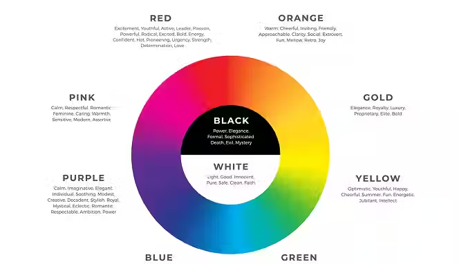
These colors work on a deeper, subconscious level to build brand perception. They are the dominant tones used in your logo, packaging, and site-wide background. For example, blue is universally linked to dependability, trust, and professionalism, which is why it dominates the tech and finance sectors . Green signals health, growth, and sustainability, making it a favorite for organic and wellness brands. Black conveys sophistication and premium quality, often used for luxury goods . These associations are not just arbitrary; they are based on evolutionary biology and cultural reinforcement, creating a "silent credibility signal" the moment a user sees your site
Navigational and Categorical Colors
As product catalogs grow, color becomes a tool for wayfinding. Instead of relying on customers to read every label, a systematic use of color allows them to scan an entire range and understand its structure instantly . For instance, a skincare brand might use light blue for moisturizers and green for cleansers. On an e-commerce grid, where thumbnails are small and detail collapses, color remains legible. This replaces micro-labeling with intuitive visual cues, helping shoppers locate the right variant faster and reducing decision fatigue.
How Does Color Psychology Work?
The mechanics of color psychology are rooted in how the human brain processes visual data. It is a blend of instant biology and learned experience that dictates how we react to a screen.
The Speed of Visual Processing
The human brain processes visual information sixty thousand times faster than text . Color processing happens within the first milliseconds of an interaction, well before conscious thought kicks in. This involves the amygdala and other limbic structures that evaluate stimuli for emotional value. For example, red wavelengths can activate areas linked to arousal and urgency, increasing heart rate. Blue light, conversely, can lower heart rate and promote analytical thinking . In e-commerce, this means a customer feels "trust" or "urgency" about a page before they even look at the product specs.
Context Overrides Symbolism
While color associations are real, they are not universal rules. They are highly dependent on context. A muted palette can signal restraint and sophistication in one category (like high-end furniture) and lifelessness in another (like children's toys) . Color works through context, not absolutes. High saturation can feel joyful and energetic in a candy store, but chaotic and cheap in a legal services website. The meaning of a color is shaped by what customers expect in that specific space. Therefore, effective color strategy involves studying your category to understand what visual signals communicate competence and credibility .
The Contrast and Legibility Factor
Color psychology fails if the user cannot actually see the interface. Contrast is the technical backbone of color strategy. Text and buttons must stand out against their backgrounds to be accessible to all users, including those with visual impairments like color blindness or low vision . Using colors that provide sufficient contrast ensures that the emotional message you are trying to send is received. If your call-to-action blends into the background, its psychological impact—whether urgency or trust—is zero because the user never registers its presence.
How Much Money Can You Make with a Color Psychology Strategy?
Investing in the right color strategy directly impacts your bottom line by influencing acquisition costs and price sensitivity. While it is difficult to attribute a specific dollar amount to a color change alone, the metrics show that color is a significant sales driver. Studies indicate that a massive 85% of consumers cite color as the primary reason they purchase a specific product . Furthermore, strategic color implementation can increase comprehension of your brand message by up to 73% and boost conversion ratios significantly .
By improving a site's stopping power, visuals affect customer acquisition costs; when a product looks credible and aligned with category expectations, attention is cheaper to buy and easier to hold . Additionally, when the visual perception matches the product experience, customers tolerate higher prices. A consistent, well-chosen color palette helps a brand look premium, which reduces price sensitivity. For small businesses in particular, using color psychology provides a long-lasting competitive edge without requiring the large marketing budgets of bigger competitors .
Most Popular Color Solutions in E-commerce for 2026
Data from 2026 reveals shifting trends in how successful e-commerce stores apply color. The days of safe, neutral palettes are giving way to bolder, more functional systems.
Muted Brights and "Dopamine" Hues
Neutral palettes are losing power because they have become associated with algorithmic sameness and fail to create a point of difference . Instead, brands are turning to "muted brights"—colors that are confident and controlled, rather than neon or aggressive. This shift is partly driven by Gen Z's preference for experiences that uplift and inspire, often referred to as the "dopamine effect" . These vibrant colors help brands cut through the visual noise of crowded social feeds and e-commerce grids, providing an instant emotional lift.
Strategic CTA Color Data
Contrary to the belief that one color fits all, the best color for a "Buy Now" button varies significantly by industry. Original research from 2026 shows distinct patterns:
- Electronics: Red and Green are highly popular and effective.
- Clothing: Black is the dominant leader, followed by a wide variety of "other" colors like pink, violet, and purple.
- Food: Red is the clear leader, with blue performing poorly. Interestingly, unusual colors like pistachio appear frequently in this category.
This data suggests that while you can start with popular options, you should always test colors against your specific audience and category expectations.
Color as an AI-Personalization Tool
The cutting edge of color strategy involves personalization. New AI agents can analyze a customer's purchase behavior and product interactions to identify their preferred color palettes . The system then filters the product catalog to recommend items that match those specific color and style tags. This moves color psychology from a one-size-fits-all site design to a dynamic, personalized product discovery experience. It combines short-term behavior with long-term preferences to offer hyper-personalized recommendations, making the shopping experience feel intuitive on an individual level.
Benefits of Color Psychology for E-commerce Brands
Implementing a thoughtful color strategy provides tangible advantages that go beyond mere aesthetics. It creates a more efficient and profitable business system.
- Lowers Customer Acquisition Costs: In crowded marketplaces, stopping power matters. A distinct and credible visual identity makes your ads and organic listings more likely to be noticed. When your brand looks aligned with category expectations, you spend less to grab attention and hold it.
- Reduces Decision Fatigue for Shoppers: Color creates visual hierarchy. It tells customers where to look first, second, and last . By using color to differentiate primary actions from secondary ones, you guide users smoothly through the checkout process. This structured approach reduces the mental effort required to navigate your store, leading to higher satisfaction and lower bounce rates.
- Increases Brand Recognition and Memory: The human brain remembers clear, repeated signals best. A consistent color system across your site, packaging, and marketing creates a strong mental shortcut . Studies show that adding color to your branding can increase brand recognition by up to 80%. When a consumer recalls your brand, the color appears before the name.
- Supports Premium Pricing: Color is a positioning tool. Black, gold, and deep purples convey exclusivity and luxury, signaling to customers that they are looking at a high-quality product. When the visual language supports the price point, customers perceive the cost as fair and justified, reducing friction at the checkout.
What is the Future of Color in E-commerce?
Looking ahead, the role of color will become even more strategic and adaptive. It is moving away from static decoration toward dynamic systems that respond to consumer needs.
The Decline of "Safe" Neutrals
Generic "eco beige" and overused pastels are fading because they no longer perform a function. They lack contrast at distance and require too much interpretation . In a visually polluted world, subtlety fails to register. The future belongs to color that is "emotionally legible"—palettes that announce their intent instantly. Brands are rejecting ambiguity in favor of clarity, choosing hues that are structurally visible on both crowded shelves and tiny mobile screens.
Dynamic and Personalized Color Experiences
Color will become a dynamic part of the user experience. As seen with concepts like BMW's color-changing car or AI-driven product recommenders, digital interfaces will increasingly adapt to the user's mood or preferences. We may see e-commerce sites that subtly shift their accent colors based on the time of day or the emotional state inferred from user behavior, creating a more empathetic and engaging shopping journey.
Color as an Identity System, Not Decoration
Color will continue to replace detailed graphics as the primary recognition asset. In fragmented contexts—like smartwatch notifications, social media thumbnails, or augmented reality try-ons—logos and typography often become too small to read. A strong, consistent color block survives this translation . Brands are designing color as infrastructure, ensuring their identity is recognizable even when reduced to a single pixel or a fleeting glimpse.
Color Psychology Examples in Action
Seeing how top brands apply these principles helps illustrate the shift from decoration to strategy.
Joybird: Cultivating Calm with Pantone

Furniture brand Joybird partnered with Pantone to use the 2026 Color of the Year, "Cloud Dancer," a soft white . For a furniture retailer, this color choice is strategic. It creates a sense of spaciousness, serenity, and visual cleanliness. It invites the customer to imagine the furniture in a calming, clutter-free home environment. This aligns with consumer research showing that shoppers in this category are looking for ways to build a calming haven. The color does the work of setting the emotional tone before the customer even looks at the sofa's fabric options.
Amorepacific: Personalized Color for Wellbeing

South Korean beauty brand Amorepacific unveiled a bath bomb that uses neuroscience to recommend fragrances and colors based on a consumer's brainwaves . Light blue is recommended to calm the user, while pastel green is suggested to combat fatigue. This is an extreme but telling example of the future of personalization. It shows how color is being used as a functional wellness tool, moving beyond marketing to become a core part of the product experience itself, responding directly to real-time consumer emotional needs.
A Guide to Choosing Colors for Your E-commerce Store
Selecting a color palette can feel overwhelming, but breaking it down into a strategic process removes the guesswork.
Start with Brand Inference, Not Aesthetics
Do not ask "What colors do I like?" Ask "What do I want customers to feel in the first few seconds?" . Do you want to be seen as calm, competent, technical, or reliable? List the traits. Then, look for colors that reinforce those assumptions. A cybersecurity firm needs to feel precise and strong (think blues and sharp forms), while a bakery needs to feel warm and friendly (oranges and rounded shapes). Begin with the emotional destination, and let the color be the vehicle.
Analyze Your Category and Competitors
Categories help customers understand products. Study the visual language of the leaders in your space. Breaking the rules can work, but only if done intentionally. If everyone in your niche uses blue to signal trust, using orange might make you look untrustworthy, or it might make you look exciting and different. You need to know which one it is before you commit. Use the industry data—for example, if you are in the food sector, be aware that blue is historically unpopular for primary branding.
Test with Purpose
Test your visuals the way you test pricing. Use A/B testing to compare two versions of a page and see which one has a better conversion rate . Start by analyzing areas that need improvement. If your CTA button isn't converting, create a variant with a different color (e.g., switching from blue to a high-contrast orange). Run the test long enough to get accurate results. Color choices should be validated by user behavior, not just internal opinions.
Top Color Psychology Mistakes to Avoid
Even well-intentioned color choices can backfire. Avoiding these common pitfalls will save you time and money.
- Treating Color as Decoration, Not Function: The biggest mistake is choosing a color scheme based solely on current trends or personal taste without considering its job. When color is an afterthought, it fails to guide users, build trust, or communicate value. Your palette must perform measurable tasks: accelerating recognition, improving navigation, and strengthening memory.
- Ignoring Contrast and Accessibility: A beautiful, subtle palette is useless if your customers can't read your text or find your "Add to Cart" button. Low-contrast palettes compress visually, losing definition on mobile screens. Always ensure there is enough contrast between text and background to meet accessibility standards. This ensures that all users, regardless of visual ability, can navigate your site.
- Chasing Aesthetics Without Understanding Function: Copying the look of a successful brand (like Apple or Tiffany) without understanding why their color system works is a recipe for failure. These companies succeeded because their visual systems consistently reinforced a clear promise. Borrowing a palette without understanding its role in that promise produces a brand that looks expensive but feels hollow.
Common Color Psychology Use Cases
Color strategy is not a one-size-fits-all solution. Here is how it applies to common e-commerce scenarios.
- Increasing Conversion on Product Pages: The primary goal is to draw the eye to the "Add to Cart" button. Use high-contrast, warm colors that stand out against the page's background. Research shows that using color strategically on these buttons can dramatically influence click-through rates, as they trigger the desired action impulse.
- Building Trust for a New Brand: For new or lesser-known stores, credibility is the biggest hurdle. Use blue tones extensively in your header, footer, and trust badges. Blue's association with dependability and professionalism helps lower the customer's guard . Consistent, high-quality imagery with a cohesive color palette also signals that the business is legitimate and established.
- Segmenting a Large Product Catalog: If you sell hundreds of SKUs, use color to help customers navigate. Assign a specific accent color to each product category or collection. This creates a visual map of your store, allowing customers to filter and find what they need intuitively, without heavy reliance on search or drop-down menus.
How to Get Started with Color Psychology
You do not need a full rebrand to start using color psychology. You can begin with small, measured steps to see what resonates with your audience.
Audit Your Current Performance
Before changing anything, look at your data. Identify the pages with the highest bounce rates or the lowest conversion rates. Is your "Buy Now" button getting lost? Do visitors leave the homepage immediately? These are clues that your visual signals might be conflicting or weak. Use this data to create a hypothesis. For example, "If we increase the contrast of the CTA button, conversions will go up."
Start with a Single Product Line
Do not overhaul your entire store at once. Select one product or one category to test your new color ideas .
- Phase 1: Choose colors based on your target customer's psychology (e.g., green for an eco-friendly line).
- Phase 2: Order small quantities of new packaging or update the product page design. Track the sales velocity compared to the previous version.
- Phase 3: If the test is successful, apply the winning color strategy across other product lines. This methodical approach prevents revenue loss from a bad guess and builds a case for wider changes.
Use Tools to Find Your Palette
Start with your brand's core values and use tools to build a palette around them. If you want to convey reliability (blue) with a touch of energy (orange), use a color wheel to find complementary shades. Remember the principle of compression: try to rely on one dominant color, one supporting contrast, and minimal variation . This creates a clear, memorable system that works across all platforms.
Conclusion
You have only seconds to make an impression. Color psychology is the tool that ensures those seconds count. By 2026, it is no longer enough for a website to look good; it must work hard. Color must function as a communication layer that builds trust, guides decisions, and anchors your brand in the memory of your customers. From the urgency of a red "Buy Now" button to the calming reliability of a blue header, every hue on your site is either building a case for purchase or creating friction. Start treating color as a business asset, and you will see the impact not just in aesthetics, but in your bottom line.
Start your dropshipping business today
Color Psychology in E-commerce FAQs
What is the most effective color for an e-commerce "Add to Cart" button?
There is no single "best" color, as effectiveness depends on your industry and site palette. However, 2026 research shows red is a popular high-performer in electronics and food, while black dominates in the clothing sector . The key is to choose a color with high contrast against your background that evokes the right action—warm colors like orange and red generally work well for urgency and conversion.
How does the Pantone Color of the Year influence e-commerce design?
The Pantone Color of the Year often sets the tone for consumer trends and brand collaborations. For example, the 2026 color "Cloud Dancer" is a soft white that brands use to convey calm, simplicity, and spaciousness . While you don't need to redesign your store around it, incorporating the color into marketing campaigns or limited-edition products can signal that your brand is current and in tune with cultural shifts.
Can using too many colors hurt my online store's sales?
Yes, using too many colors can dilute your brand message and confuse customers. Cognitive psychology shows that memory works best with clear, repeated signals . A complex palette makes it hard for the brain to form a strong association with your brand. It is more effective to use a few, bolder colors consistently to create a powerful visual identity and reduce cognitive load for the shopper.
How do I choose colors that appeal to my specific target audience?
Start by considering the emotions and values associated with your audience. For eco-conscious consumers, green and brown signal sustainability . For luxury buyers, black, gold, and purple convey exclusivity. For a professional B2B audience, blue communicates reliability. Your color choices should reinforce what your target market already cares about and expects from your product category.
Why do neutral colors like beige seem less popular in 2026 web design?
Neutral palettes are losing power because they have become associated with algorithmic sameness and fail to create contrast in crowded retail environments . They often require too much interpretation and can appear indistinct on digital shelves. Bold, "emotionally legible" colors are replacing them because they work faster to capture attention and create a memorable impression.
Is it necessary to A/B test my website's color scheme?
A/B testing is highly recommended for optimizing conversion rates . While color psychology provides a strong starting point, your specific audience may react differently. Testing allows you to compare different versions of a page—like a red button versus a green one—to see which one actually drives more sales. This takes the guesswork out of design and bases decisions on real user data.


Launch your dropshipping business now!
Start free trial.avif)


Related blogs
Top WordPress eCommerce Themes for 2026
Explore the best WordPress eCommerce themes for 2026. Compare WooCommerce themes by speed, design, features, and dropshipping potential.


Saba Mohebpour Didn't Stop at Spocket: His New $50M Fund, ILA Capital, Is Buying Up Shopify and Amazon Apps
After building Spocket into a major ecommerce platform, Saba Mohebpour is launching ILA Capital with a $50M strategy to acquire Shopify and Amazon apps powering modern ecommerce.

Top Trendsi Alternatives for Fashion Dropshipping
Explore the best Trendsi alternatives for fashion dropshipping, fast shipping, branding, Shopify integration, and reliable suppliers.