50+ Best Google Fonts for Websites and Brands
Discover the best Google Fonts for your website and brand. Explore elegant, modern, and creative fonts with perfect pairings to make your design stand out.

.avif)

Typography isn’t just about letters — it’s about personality, emotion, and brand recognition. The right Google font can transform a simple webpage into a memorable brand experience. With over 1,400 options available, Google Fonts gives designers, developers, and entrepreneurs a free and versatile way to elevate their brand’s digital presence.
Whether you’re designing an online store with Spocket, building your brand identity, or refining your blog’s readability, your choice of font makes a lasting impression. Let’s explore the 50+ best Google Fonts that help websites and brands look modern, trustworthy, and professional.
Why Google Fonts Matter for Your Brand
Every brand communicates a message — and typography amplifies that message visually. Fonts influence how people feel when they interact with your website. A clean sans-serif font signals modernity and minimalism, while a serif font evokes tradition, luxury, or authority.
Google Fonts is a designer’s best friend because it offers:
- Free access to hundreds of high-quality fonts.
- Fast performance optimized for the web.
- Easy integration using simple CSS or <link> tags.
- Brand consistency across devices and browsers.
Think of it as your brand’s wardrobe — your font should “fit” your identity. Just as Spocket helps brands source high-quality products for their stores, Google Fonts helps you build a visual identity that feels premium and cohesive.
How to Choose the Right Google Font
Picking the perfect font isn’t about personal taste — it’s about aligning your typography with your brand’s strategy and audience experience. The right Google font enhances readability, conveys personality, and ensures your design looks consistent everywhere.
1. Brand Personality
Your font should mirror who you are as a brand. Each typeface has a personality — modern, classic, playful, or bold.
- Modern brands often use fonts like Poppins, Roboto, or Inter for a clean, forward-thinking look.
- Luxury or editorial brands prefer Playfair Display or Cormorant Garamond to convey elegance.
- Friendly and youthful brands use Nunito or Quicksand to appear approachable.
A font can say a lot without words — choose one that fits your tone.
2. Readability
The most beautiful design fails if your text isn’t easy to read.
- Pick fonts with clear letterforms and ample spacing.
- Avoid overly decorative fonts for long paragraphs.
- Test different screen sizes to see if the text remains legible.
Fonts like Open Sans, Lato, and Inter are excellent choices for readability on digital platforms.
3. Font Pairing
Font pairing creates visual structure — one font grabs attention for headlines, while the other supports it in the body text.
- Montserrat + Merriweather → modern and trustworthy.
- Poppins + Roboto → balanced and tech-friendly.
- Lora + Open Sans → classic yet approachable.
Pair fonts that complement each other rather than compete. Consistent typography builds brand credibility and user comfort.
4. Consistency Across Devices
A great font must perform well across all screens — desktop, tablet, and mobile.
- Test how your chosen fonts scale and render.
- Avoid fonts that appear too thin or condensed on smaller screens.
- Stick to web-optimized fonts and limit the number of styles to keep your site fast.
Consistency in typography ensures your brand looks professional everywhere your audience finds you.
50+ Best Google Fonts for Websites and Brands
Typography defines how your brand feels to users — modern, trustworthy, or bold. With so many Google Fonts available for free, choosing the right one helps you create a consistent and professional identity across your website, store, and marketing materials.
Below, we’ve categorized the 50+ best Google Fonts by style — from sans-serif to serif, display, and high-readability fonts — with clear explanations on where each one shines.
Best Sans-Serif Google Fonts
Sans-serif fonts are clean, modern, and highly versatile. They work beautifully for tech startups, digital brands, and eCommerce stores that want a polished yet approachable design.
1. Open Sans
A digital design classic, Open Sans is easy on the eyes and perfect for blogs, mobile apps, and corporate websites. Its neutral tone makes it a reliable choice for professional branding.
2. Lato
Warm and welcoming, Lato combines professionalism with friendliness. Its rounded letterforms make it ideal for customer-centric brands and service-based websites.
3. Roboto
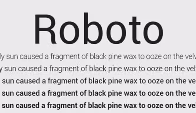
Designed by Google, Roboto is the backbone of Android’s interface. It’s crisp, geometric, and highly legible — perfect for app interfaces, product pages, and startups.
4. Poppins
Geometric yet friendly, Poppins feels modern and energetic. Its even letter spacing makes it a favorite for headlines, minimalist stores, and creative portfolios.
5. Montserrat
A modern classic inspired by urban typography from Buenos Aires. Montserrat offers structure and sophistication, making it perfect for branding, banners, and bold headings.
6. Nunito
Round and friendly, Nunito feels approachable and easy to read. It’s great for educational websites, lifestyle brands, or wellness-focused eCommerce stores.
7. Source Sans Pro
Adobe’s first open-source typeface, Source Sans Pro is built for clear on-screen readability. Ideal for documentation, long-form articles, and digital products.
8. Inter
Known for its balanced proportions, Inter is perfect for digital interfaces and dashboards. It was designed specifically for clarity on computer screens and mobile devices.
9. Work Sans
A clean and legible font family tailored for digital UX. Work Sans performs beautifully in both small paragraph text and product descriptions.
10. Mulish
Elegant and minimal, Mulish combines clarity with sophistication — great for brands that value a sleek, lightweight aesthetic.
11. Heebo
A clean, modern sans-serif with a geometric tone. Heebo is perfect for minimalist websites, landing pages, and tech-driven brands needing a sleek, understated identity.
12. Space Grotesk
A futuristic sans-serif inspired by geometric forms. Excellent for modern brands, fintech, and portfolio sites with a sharp, contemporary feel.
13. Manrope
A balanced combination of geometric and modern-humanist style. Ideal for product landing pages, premium brands, and digital platforms.
14. Exo 2
Tech-inspired and versatile, Exo 2 works beautifully for technology companies, SaaS brands, and anything related to innovation.
15. Ubuntu
Named after the well-known operating system, Ubuntu has a friendly and open look. Perfect for open-source projects, startups, and community-focused brands.
16. Archivo
Designed for headlines and high-performance typography. Archivo is excellent for editorial layouts, modern eCommerce banners, and impactful headers.
17. Titillium Web
Created as an academic typographic experiment, it blends professionalism with creativity. Perfect for education brands, agencies, and modern blogs.
18. Asap
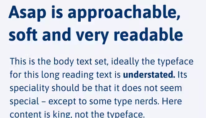
A modern sans-serif optimized for speed and readability. Great for mobile-friendly websites and fast-loading stores.
Best Serif Google Fonts
Serif fonts are timeless and elegant, often used to project credibility, tradition, and luxury. They’re great for editorial designs, law firms, or premium eCommerce brands.
19. Playfair Display
A luxurious serif that captures attention. Playfair Display is a favorite in fashion, beauty, and editorial design for its graceful contrast and high-end appeal.
20. Merriweather
Made for long reading sessions, Merriweather is a web-safe serif that balances legibility with style — perfect for blogs and online publications.
21. Crimson Text
Elegant yet restrained, Crimson Text adds a touch of literature and classic beauty. Excellent for academic or creative projects.
22. Lora
Lora bridges the gap between traditional and modern aesthetics. Its gentle curves and steady rhythm make it suitable for storytelling websites and brand blogs.
23. Cormorant Garamond
A nod to classic print typography, Cormorant Garamond adds sophistication and artistic charm — perfect for luxury or boutique websites.
24. Roboto Slab
A slab-serif counterpart to Roboto, Roboto Slab balances strength with readability. It’s excellent for headlines or professional websites.
25. PT Serif
Balanced and elegant, PT Serif works well for editorial layouts and gives your design an intellectual edge.
26. Cardo
Cardo feels scholarly and refined, ideal for projects rooted in history, culture, or education.
27. Libre Baskerville
Clean and stable, Libre Baskerville is great for body text on blogs or professional service websites where readability is key.
28. Arvo
Modern with a hint of structure, Arvo stands out in headings or branding projects that need a touch of authority and balance.
29. Spectral
An elegant, high-contrast serif created for digital reading. Works beautifully on editorial sites, fashion blogs, and content-heavy publications.
30. Fraunces
A soft, expressive serif with personality. Ideal for boutique brands, lifestyle websites, and editorial-style headings.
31. Zilla Slab
Developed by Mozilla, Zilla Slab has a strong presence with great readability. Perfect for professional brands or educational platforms.
32. Domine
A classic serif designed specifically for comfortable reading at small sizes. Excellent for long blog articles and news websites.
33. Vollkorn
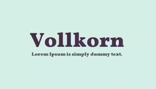
Known as the “workhorse serif,” Vollkorn is a robust, timeless option for literature websites, portfolios, and online magazines.
34. Prata
A stylish serif with a luxurious, elegant presence. Works well for beauty brands, upscale eCommerce stores, and fashion websites.
Best Display & Creative Google Fonts
Display fonts are expressive and bold — made to attract attention. They work best for headlines, banners, and creative brand identities.
35. Oswald
A modernized gothic typeface, Oswald brings structure and boldness. Great for fashion, sports, or tech-related brands that want a strong visual presence.
36. Raleway
Thin, sleek, and sophisticated, Raleway is perfect for high-end websites and logo designs that emphasize simplicity and refinement.
37. Bebas Neue
A tall, bold sans-serif font that dominates in advertising and posters. Bebas Neue is perfect for bold calls to action and digital branding.
38. Abril Fatface
Retro and striking, Abril Fatface gives any design an editorial, luxurious touch — perfect for magazines or fashion boutiques.
39. Pacifico
A fun, hand-drawn script font. Pacifico is relaxed and friendly, ideal for casual brands and creative personal sites.
40. Great Vibes
Stylish and cursive, Great Vibes feels elegant and romantic — perfect for event planning, invitations, or signature-style logos.
41. Cinzel
Modeled on classical Roman inscriptions, Cinzel conveys strength and prestige — ideal for luxury brands, architecture firms, or high-end services.
42. Lobster
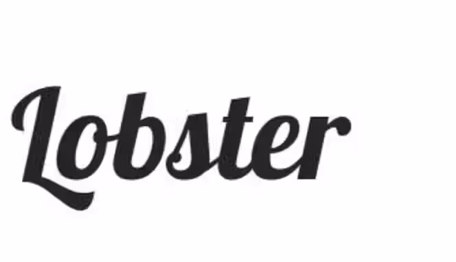
Bold and decorative, Lobster adds character and uniqueness. Great for creative agencies, handmade product brands, or cafes.
43. Alfa Slab One
A heavy and bold font that demands attention. Use Alfa Slab One for headlines or brand logos that want to make a big statement.
44. Fredoka One
Rounded and cheerful, Fredoka One gives a youthful and energetic vibe — great for kids’ brands or creative startups.
45. Amatic SC
A quirky, handwritten display font ideal for creative projects, handmade product branding, and fun websites.
46. Bungee
Bold, urban, and expressive — perfect for signage-style logos, event branding, or eye-catching hero text.
47. Satisfy
A smooth, cursive script font with personality and flow. Ideal for personal brands, creative boutiques, or lifestyle blogs.
48. Sacramento
A monoline, retro-style script that adds elegance without overpowering your design. Perfect for subtle branding touches and signature-style logos.
49. Righteous
Inspired by futuristic and geometric shapes, Righteous adds a playful edge. Great for gaming websites, youth-oriented brands, and creative agencies.
Best Fonts for Readability
These fonts prioritize legibility, making them perfect for blogs, news websites, and product descriptions where the reading experience matters most.
50. Noto Sans
A universal font family that supports 800+ languages. Noto Sans is perfect for international brands and multilingual websites.
51. Cabin
Cabin combines geometric precision with warmth. It’s great for digital content, portfolios, and professional service sites.
52. IBM Plex Sans
Designed by IBM, this font embodies corporate professionalism. Its balanced design works across presentations, UI, and digital branding.
53. Oxygen
Engineered for optimal on-screen display, Oxygen is ideal for tech sites, dashboards, and web apps.
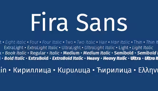
54. Fira Sans
Developed for Mozilla, Fira Sans emphasizes clarity and usability. It’s a fantastic font for landing pages and product-focused websites.
55. Karla
Clean and modern with a humanist touch, Karla is perfect for blogs, product descriptions, and brand storytelling.
56. Hind
A highly readable typeface family designed for UI and long-form reading. Perfect for multilingual sites due to its excellent Indian language support.
57. Muli (Murecho)
A clean, minimalistic font ideal for lightweight modern interfaces, landing pages, and digital-first brands.
Top Google Font Pairings for Websites
Pairing fonts helps create a visual rhythm between headings and body text. Here are some combinations that bring design harmony:
- Montserrat + Merriweather → A balance of modern and classic sophistication.
- Poppins + Roboto → Sleek, minimal, and perfect for tech startups.
- Lora + Open Sans → Professional yet warm — great for content-driven sites.
- Playfair Display + Source Sans Pro → Editorial elegance with everyday usability.
- Raleway + Lato → Minimalist and corporate — excellent for brand websites.
When you combine fonts strategically, your site feels cohesive and intentional — much like how Spocket ensures quality consistency across its supplier network.
Fonts That Reflect Your Brand Personality
Your brand’s font should represent its tone, values, and identity. Here’s how to choose based on brand type:
Modern & Minimal Brands
- Poppins
- Inter
- Roboto
- Work Sans
Clean, neutral, and structured — perfect for SaaS, tech startups, and eCommerce stores.
Luxury & Elegant Brands
- Playfair Display
- Cormorant Garamond
- Abril Fatface
- Cinzel
Refined and classic — these fonts convey sophistication and timeless appeal.
Friendly & Approachable Brands
- Nunito
- Quicksand
- Fredoka One
- Karla
Soft edges and round forms make these ideal for wellness, lifestyle, and education.
Creative & Bold Brands
- Raleway
- Oswald
- Bebas Neue
- Alfa Slab One
Strong and expressive — great for creative agencies, marketing brands, and startups that want to stand out.
How to Add Google Fonts to Your Website
Adding Google Fonts to your website is a simple, beginner-friendly process that can instantly improve your brand’s look and feel. These fonts are free, reliable, and optimized for performance, making them ideal for businesses, blogs, and online stores.
Below are clear steps to help you integrate Google Fonts into your site correctly.
Step 1: Visit Google Fonts
Go to Google Fonts.
Here, you’ll find thousands of free and open-source fonts. You can filter them by category (serif, sans-serif, display, handwriting), popularity, or style.
Tip: Use the text preview option to type your own content, such as your brand name or tagline, to see how it looks in different fonts.
Step 2: Select Your Font
After finding a font that fits your brand, click on it. You’ll see a list of available styles and weights, such as Regular (400), Bold (700), or Italic (400i).
Select only the styles you need. For example:
- Use Regular (400) for paragraphs.
- Use Bold (700) for headings.
Limiting the number of styles helps keep your site fast and lightweight.
Step 3: Copy the Embed Code
When you’ve chosen your font and styles, Google Fonts will provide an HTML embed code.
It will look like this:
<link href="https://fonts.googleapis.com/css2?family=Roboto:wght@400;700&display=swap" rel="stylesheet">
Place this line inside the <head> section of your website’s HTML file:
<head>
<meta charset="UTF-8">
<title>My Website</title> <link href="https://fonts.googleapis.com/css2?family=Roboto:wght@400;700&display=swap" rel="stylesheet">
</head>
This ensures your chosen font loads as soon as someone visits your site.
Step 4: Apply the Font Using CSS
After embedding the link, open your main CSS file (for example, style.css) and define the font family you want to use.
Example for body text:
body {font-family: 'Roboto', sans-serif;}
You can also use different fonts for headings and paragraphs:
h1, h2, h3 {font-family: 'Poppins', sans-serif;}
p { font-family: 'Roboto', sans-serif;}
This combination helps create hierarchy and visual distinction between headings and content.
Step 5: Optimize for Performance
To ensure your website loads quickly and smoothly, follow these best practices:
- Load only necessary styles: Avoid adding all weights or italics if you don’t need them.
- Use display=swap: This makes text visible immediately, even if the font takes a second to load.
- Test font performance: Use tools like Google PageSpeed Insights to ensure your site stays fast.
- Consider self-hosting fonts: For more control, you can download and host the fonts on your own server.
Best Practices for Using Google Fonts
Typography is more than just decoration — it’s a key part of your brand’s identity. The right Google Font enhances readability, strengthens brand consistency, and improves user experience. The wrong one, however, can make your site look unprofessional or cluttered.
To ensure your typography supports your brand and design goals, follow these essential best practices:
1. Use 2–3 Fonts Maximum
Keep your typography simple and consistent.
Use:
- One font for headings (something bold and distinctive)
- One font for body text (something easy to read)
- Optionally, one accent font (for callouts or quotes)
Using too many fonts makes your website look disorganized and visually overwhelming. Sticking to a limited number helps maintain a cohesive and professional appearance.
2. Maintain Visual Hierarchy
Typography hierarchy helps guide the reader’s attention through your content. You can create hierarchy by:
- Adjusting font sizes (larger for headings, smaller for paragraphs)
- Varying weights (bold for titles, regular for body)
- Using consistent spacing and alignment
This structure makes your content easier to scan and understand, improving the overall reading experience.
3. Prioritize Load Speed
Fonts can impact how fast your website loads. Avoid adding multiple font families or unnecessary weights (like extra bold, semi-bold, or thin). Each one adds additional requests that slow your site down. A fast-loading site improves both user satisfaction and SEO performance, so always optimize for speed.
4. Ensure Accessibility
Accessibility should never be overlooked. High readability ensures that everyone, including users with visual impairments, can navigate your content comfortably.
Keep these in mind:
- Maintain high contrast between text and background (e.g., dark text on light backgrounds).
- Avoid fonts that are too thin or have low legibility.
- Use adequate line spacing for longer paragraphs.
A visually accessible design communicates inclusivity and professionalism.
5. Test Across Devices
What looks great on a desktop might not look the same on a phone or tablet.
Always test your fonts on multiple devices, browsers, and screen resolutions.
Check for:
- Proper alignment and readability on smaller screens
- Font size consistency between desktop and mobile
- Clear visibility in both light and dark mode themes
Testing ensures that your chosen Google Font maintains its clarity and impact no matter where it’s viewed.
Typography Trends to Watch
Typography is evolving. Here are current trends shaping how brands use Google Fonts:
- Variable Fonts: Dynamic typefaces that adjust weight and width for responsive designs.
- Bold Headings + Minimal Body Text: A growing trend for landing pages.
- Rounded Fonts for Approachability: Brands are shifting toward softer shapes for warmth.
- Dark Mode Optimization: Fonts that look great on both light and dark themes.
- Retro Revival: Fonts like Abril Fatface and Cormorant Garamond are making a comeback.
Conclusion
Typography isn’t just visual — it’s emotional. The best Google Fonts help your brand tell its story before a single word is read. Whether you choose the modern simplicity of Poppins or the elegance of Playfair Display, every typeface contributes to your digital identity.
Just like Spocket helps eCommerce entrepreneurs scale effortlessly with premium global suppliers, choosing the right font helps your website project professionalism and trust. Your brand deserves typography that speaks clearly and confidently — because every letter counts.
Start your dropshipping business today
FAQs about Google Fonts for Websites and Brands
What are Google Fonts and why should I use them?
Google Fonts is a free and open-source library of web-optimized typefaces that allows you to easily customize the look of your website. It ensures fast loading, cross-browser compatibility, and a wide selection of styles that fit different brand personalities. Using Google Fonts helps your site maintain a consistent, professional appearance without requiring any additional licensing fees.
How do I choose the right Google Font for my brand?
Choosing the right font depends on your brand’s tone and target audience. A modern, minimal brand might benefit from clean fonts like Poppins or Inter, while elegant or high-end brands may prefer serif fonts like Playfair Display or Cormorant Garamond. The key is to select a font that reflects your brand personality while ensuring it remains easy to read across all devices.
Can I use more than one Google Font on my website?
Yes, you can use multiple Google Fonts, but it’s best to limit yourself to two or three. For example, you can use one font for headings and another for body text to create visual hierarchy. Mixing too many fonts can make your design appear inconsistent and affect your website’s loading speed, so simplicity and consistency are always the best approach.
Are Google Fonts free for commercial use?
All fonts available on Google Fonts are completely free to use for both personal and commercial purposes. This means you can include them in websites, applications, print materials, and branding without paying any license fees. Since they are open-source, you can even customize or host them locally to better fit your project’s technical setup.
How do I add Google Fonts to my website?
Adding Google Fonts to your website is a straightforward process. You simply choose a font from the Google Fonts website, copy the provided <link> tag, and paste it into your website’s <head> section. Once added, you can reference it in your CSS file using the font-family property. This allows your website to display consistent, high-quality typography that enhances your overall design and user experience.


Launch your dropshipping business now!
Start free trial


Related blogs

How to Set Up Automated Order Fulfillment With Spocket and Shopify
Set up a smoother Shopify dropshipping workflow with Spocket by connecting your store, importing products, processing orders, syncing tracking, and reducing manual fulfillment tasks.


How to Open a Business Bank Account for Your Dropshipping Store
Set up your dropshipping finances the right way with a dedicated business bank account built for payouts, supplier payments, taxes, and long-term store growth.

Spocket vs Dropified: Which Tool Is Better for Multi-Store Scaling?
Compare Spocket and Dropified for multi-store dropshipping, supplier quality, automation, fulfillment, product sourcing, and scaling across ecommerce platforms.